
Dahlia 3
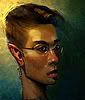
 This is where Dahlia has become. The first was a continuation to the previous one, until I got carried away and overloaded the entire thing. The second is my attempt to remedy the situation. Now, I don't know what to think, so I'm asking you guys. Which/what do you think I should do?


13 comments:
These are both really beautiful. I liked the last version, but the composition of this is just beautiful, with the flowing flowers and her face peeking out from behind them.
I actually feel like the flowers should be all black and white, though, with MAYBE a hint of color, or a single blossom colored. Right now in the colored version, I feel like the flowers are overpowering her face, but the unfinished b&w version next to it is just breathtaking. I actually think having black and white flowers puts a unique spin on it, too, since flowers are usually colored.
I like the black and white version a lot more. It focuses on her face and there's a lot of room to go crazy and ornamental with the petal headdress/hair :)
Both are really beautiful, but I prefer the second one too. =) I don't have any suggestion, but I just feel it lighter and more "fresh"...
I always love to look at your beautiful works even if I don't comment so often.. but they leave me speechless =)
Keep the second one!...its really beautiful!!.... the purple lips on the shades of grey is really awesome!...i love it!
Nice!
I like the second one better but i feel the lips are a bit heavy and dark for the rest of the piece
The black in the first one is much more interesting than the white but the second one isn't as overloaded. I think the first one could work if you toned down the saturation of the flowers a little bit. They are both beautiful though I like the mix of lines and simple shapes with the painted face.
I'm definitely leaning more toward the second one. The black is a little overpowering with all the color.
And as opinions differ, I really like the pop of color in her lips in the second one. *shrug*
She's a beauty though!
Awesome, thanks so much for the feedback. I was leaning toward the second one as well, so I'm glad you guys seem to gravitate towards it.
Greta, I was thinking the same thing with the lips. I will have to take out some of the black to lighten it up a bit.
I might right again to capture the energy of the initial sketch, but for right now I think I will go on with the second version and see how that turns out.
Thanks again you guys! Lots of good comments:D
yep, def the one on the right. the red lips are really powerful and the lack of too many colours brings a subtle hint of amazing to it.
this is stunning! beautiful job!
The black and white looks more lighter, fluid and pretty :3
oh my goshhh this is beaudiful !!
well...i'm not an artist like all of you here (i can't even draw/sketch :( but i think i'll go for the 2nd one...just bcos with those B&W flowers... it doesn't take away your look from the eye of the girl. looove it :)
Post a Comment